Med Spa Website Design That Turns Visitors Into Booked Appointments


Key Takeaways
- Put a book button in the header and the hero of every page, so booking never depends on a phone call.
- Build one page per treatment with a price range, consented results, practitioner credentials and the questions your front desk hears.
- Treat speed as part of the design: Google calls a page good when its main content loads within 2.5 seconds.
- Judge the site by booked appointments per page and per traffic source, not by visits or compliments on the look.
Good med spa website design makes booking the easiest action on every page. That means a book button in the header and the hero, one page per treatment with a price range, consented results and credentials, and pages that show their main content within 2.5 seconds on a phone. Visual polish comes after those.
Most med spa traffic arrives on a phone, from an ad, a map listing or a friend's text. By then the visitor has picked the treatment. The website decides whether they pick your clinic and book, or press back and tap the next result.
This guide covers the parts of med spa web design that move bookings: the homepage, treatment pages, prices, proof, speed, the booking process, ad landing pages and tracking. Each section uses real clinic pages or published numbers, with the source linked.
What a med spa website has to do
A medical spa website has two jobs at once: build trust for a medical decision and make booking the easiest next step.
That is what separates spa web design from a salon or restaurant site. The visitor is about to let a stranger inject their face, so credentials, consented results and clear prices carry more weight than mood photos or clever copy.
Good spa website design pairs a calm, premium look with plain facts: who treats you, what it costs, what to expect and where to book. A site that stands out visually but hides those facts sends visitors to a competitor whose price is on the page.
The homepage: booking above the fold
On the homepage, a visitor should see what you offer, where you are and how to book, all before the first scroll.
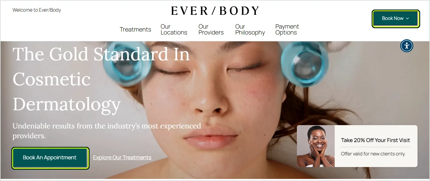
Ever/Body, a cosmetic dermatology chain, shows the pattern. A Book Now button sits in the header, a Book An Appointment button in the hero, and a 20% first-visit offer for new clients next to it. One action, repeated, with a reason to take it today.
- Treatments and city in the headline, so a visitor from a map listing knows they landed in the right place.
- One primary button that opens the booking process, not only a phone number that works during office hours.
- One line of proof, such as your Google rating and review count, or years in practice.
- A real photo of your clinic or team. Stock models make most spa websites look the same.
Keep the menu short: treatments, pricing, results, about, book. A dropdown with 40 treatment links is hard to use on a phone; put them on a treatments page grouped by concern instead.
Treatment pages that rank and book
Give every treatment its own page. A single services page answers nobody's question and ranks for none of the treatment plus city searches.
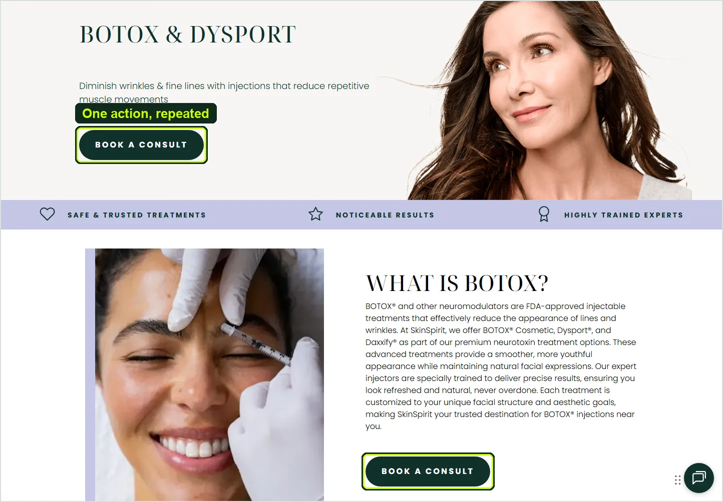
SkinSpirit's Botox and Dysport page is a clean example. The hero names the treatment, says what it does in one line and offers Book a Consult. A short explainer below ends with the same button, followed by before-and-after photos, an expert quote and FAQs.
Every treatment page we build for med spa clients follows one skeleton, so patients and search engines both know where to look for each answer:
Seven sections, in this order, on every treatment page.
- Direct answer. What the treatment does and who it suits, in two or three sentences, with a book button beside it.
- Price range. A starting price or range, plus what changes the final number: units, syringes, areas or sessions.
- Consented results. Before-and-after photos from your own clinic with written consent, the number of sessions, and typical rather than best-case outcomes.
- What to expect. Appointment length, downtime, when results show and how long they last.
- Who treats you. The injector or provider by name, their license and years of experience, and the supervising physician.
- Front desk questions. The 6 to 8 questions your staff answer every week, written as short answers.
- Second booking block. The same book button at the end, with the offer or the next open times if your scheduler shows them.
These treatment pages also carry most of your search traffic, because each one matches a search like Botox in Scottsdale. Our med spa SEO guide explains how they work with your Google Business Profile and the map pack.
Prices on the page
Publish a price range or a starting price on every treatment page. It filters out the wrong inquiries before they reach your front desk.
Hidden pricing moves the work to your staff. Every call that opens with how much is Botox here is a question the website should have answered at 11 p.m., when the visitor was ready to book.
Where price depends on the dose, say so: a per-unit price for neuromodulators, a per-syringe price for filler, a per-session or package price for lasers. A range with one line on what moves it builds more trust than a Call for pricing button.
A clear entry offer works the same way on a landing page. Send ad traffic to a page built for one first-visit offer, with the offer price shown next to the regular price.
Results photos, reviews and the FTC
Before-and-after photos and reviews are your strongest proof. Both come with rules that apply directly to medical aesthetics.
The FTC's Health Products Compliance Guidance says testimonials that report results more dramatic than people normally get are likely deceptive, and that a results not typical line does not cure the problem.
In practice that means written consent for every photo, the same lighting and angle before and after, no retouching, the number of sessions stated, and a realistic spread of outcomes instead of only your best case.
Put reviews next to the booking button, not on a separate testimonials page. BrightLocal's 2026 Local Consumer Review Survey found 74% of consumers look for reviews from the last three months, and 47% won't use a business with fewer than 20 reviews.
A live feed of recent Google reviews does more than a page of quotes from 2021. Our guide to med spa review management covers how to keep that feed fresh within Google's and the FTC's rules.
Speed and responsive design on a phone
A slow page wastes the click you already paid for. Speed belongs in the design brief, not on a to-do list for after launch.
Google's Core Web Vitals set the bar: main content visible within 2.5 seconds, a response to taps within 200 milliseconds, and a layout shift of 0.1 or less, measured at the 75th percentile of real visits.
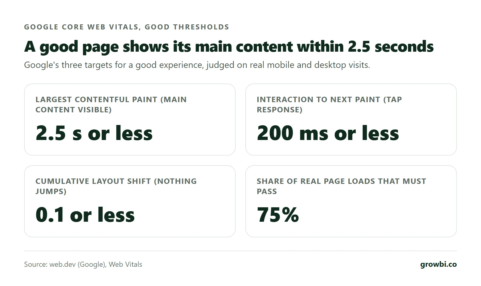
Responsive design means more than a layout that shrinks. On a phone the book button stays within thumb reach, text reads without zooming, and the scheduler opens without a second login or a new tab.
Four problems slow down most med spa sites, and none of them needs a redesign to fix. Here is each one with its direct fix:
- Autoplay hero videos that load before the headline. Use a compressed still under 100 KB and play the video on tap.
- Booking widgets on every page that pull in third-party scripts. Load the scheduler on the booking page or when someone taps Book.
- Chat, review and pop-up widgets stacked together. Keep one and remove the rest.
- Uncompressed photos. Serve WebP images sized to the screen and lazy load anything below the fold.
The booking process: scheduler or form
Real-time online booking is the better default. People research treatments in the evening and want to lock in a time while they are interested.
A contact form that promises a call back adds a delay at the moment of intent. If your clinic requires a free consultation first, keep the form to name, phone, treatment and preferred time, then confirm by text within minutes.
Whichever you choose, optimize the booking path for people who show up rather than for form fills. A cheap form fill that never arrives costs more than a pricier lead who does.
Our med spa lead generation guide covers the follow-up path after a form, and the email and SMS follow-up guide covers the reminders that cut no-shows.
Landing pages for paid ads
Send paid traffic to a page built for one treatment and one offer, not to the homepage with its 12 menu items.
The math is simple: cost per lead equals cost per click divided by the page's conversion rate. WordStream's 2026 Google Ads benchmarks put Beauty and Personal Care at a $4.62 average click and a 10.35% conversion rate.
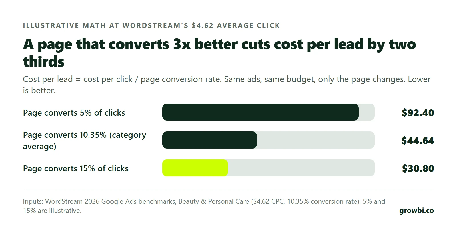
At that click price, a page converting 5% of visitors costs $92.40 per lead. Lift it to 15% and the same lead costs $30.80. In our experience, few bid or targeting changes cut cost per lead by two thirds.
If you advertise on Meta, the landing page also has to follow Meta's policies for health and appearance claims. Read our guide to Meta ads compliance for med spas before you write the page.
Accessibility, privacy and tracking
Medical spas are businesses open to the public, and the Department of Justice says the ADA covers what those businesses offer on the web.
The DOJ's web accessibility guidance lists the common barriers: low color contrast, images without alt text, color as the only cue, videos without captions, unlabeled forms and menus that need a mouse. Pale gray text on a cream background, a popular med spa look, fails the first test.
Accessible pages give a better user experience to everyone. Labeled form fields and large tap targets help a 55-year-old filler patient on a phone as much as a screen reader user.
Tracking needs the same care. Booking pages collect health details, so keep ad pixels off any page where a patient enters medical information and send only booking events back to the ad platforms. Confirm the setup with your compliance counsel.
Local SEO built into the design
Design decisions affect rankings. The page structure that helps a visitor book also helps Google match your clinic to local searches.
Add LocalBusiness structured data. Google's local business documentation asks for the most specific sub-type possible, requires a name and address, and recommends hours, phone and price range.
Keep name, address and phone identical in the site footer, your Google Business Profile and every directory, because your online presence is only as consistent as its weakest listing. Build one real page per location you treat patients in.
Skip the 30 near-identical city pages. Google's spam policies list pages targeted at specific regions or cities that funnel users to one page as doorway abuse.
What to measure after launch
Judge the site by booked appointments, not by traffic or compliments on the look. Five numbers show where a clinic website leaks.
- Booking starts per session. What it tells you: Whether visitors find and tap the book button; Where to find it: Analytics event on the book button
- Booking completion rate. What it tells you: Friction inside the scheduler itself; Where to find it: Scheduler report against booking starts
- Mobile LCP at the 75th percentile. What it tells you: Whether paid clicks wait for the page; Where to find it: PageSpeed Insights, mobile tab
- Bookings per treatment page. What it tells you: Which pages deserve more ad budget; Where to find it: Booking system, by landing page
- Calls by source. What it tells you: Phone bookings credited to the right channel; Where to find it: Call tracking numbers per channel
Connect these to your booking system so each appointment carries its source and landing page. Then the question of which page or channel fills the calendar has a real answer, and budget follows it.
If you want a second pair of eyes on those numbers, book a free 15-minute call and we will go through your site, one treatment page and your booking flow on a phone.
Choosing who builds your med spa website
A web design studio, a digital marketing agency and a template builder will all deliver pages. Ask each one the same four questions first.
- Who owns the domain, the site files and the analytics accounts if we part ways?
- Will every treatment get its own page, and who writes and updates the copy?
- How will booking starts and completed bookings be tracked from launch day?
- What mobile Largest Contentful Paint does the finished site hit, measured rather than promised?
A designer who answers with portfolio shots instead of booking numbers is selling the look. If you want the site built and tested together with your ads and follow-up, see how our med spa marketing service works.
FAQs
What makes a good med spa website?
A book button on every screen, one page per treatment with a price range and consented results, named practitioners with credentials, main content visible within 2.5 seconds on a phone, and tracking that ties each page to booked appointments. Visual style matters, but less than those five.
How much does a med spa website cost?
It ranges from a template refresh to a custom build with an integrated scheduler. Price it against bookings: if a better landing page lifts conversion from 5% to 10% on paid traffic, cost per lead halves. Whatever you pay, make sure you own the domain, the site and the analytics accounts.
How often should a med spa redesign its website?
When the site blocks bookings, not on a calendar. Fix speed, booking placement and treatment pages first, since those changes are smaller and easy to measure. Rebuild when the platform cannot load fast, cannot connect to your scheduler or cannot hold one page per treatment.
Conclusion
Med spa website design is judged at one moment: a visitor on a phone deciding whether to book. Everything on the page either builds trust for that decision or turns more visitors into booked patients, and the rest is decoration.
Start with the changes that are easy to measure: a book button in the header and hero, one page per treatment with prices and real results, main content within 2.5 seconds, and tracking tied to appointments.
If you want to know where your own site loses bookings, book a free 15-minute call. We will review your homepage, a treatment page and your booking flow on a phone, and show you the first fix to make.
Mor Romano
CTO, Growbi
Written and fact checked by Mor Romano, published , last reviewed .
More about Mor RomanoGet this system built for your business
Book a strategy call and we will model a realistic appointment target from your budget, market, and offer.